So there was some interest by 3 of you readers (lol) for photo editing tutorials. So I'm going to do a few. Plus I'll actually be posting something for you guys to like, take part in. If you use this little tutorial and blog pictures that you used it on, send them to me! :) I might do a little post of pictures ya'll edited!
I do have Photoshop, but I know a lot of people don't, and there aren't any tutorials for using Pixlr that I can find. So hopefully this will be useful. Pixlr is a free online editing program, very similar to Photoshop. No, it does not have all the gadgets, or features that Photoshop has, but it has enough and is similar enough in layout, that if you learn to use Pixlr, when you do get Photoshop (if you do), you will pretty much know how to use it.
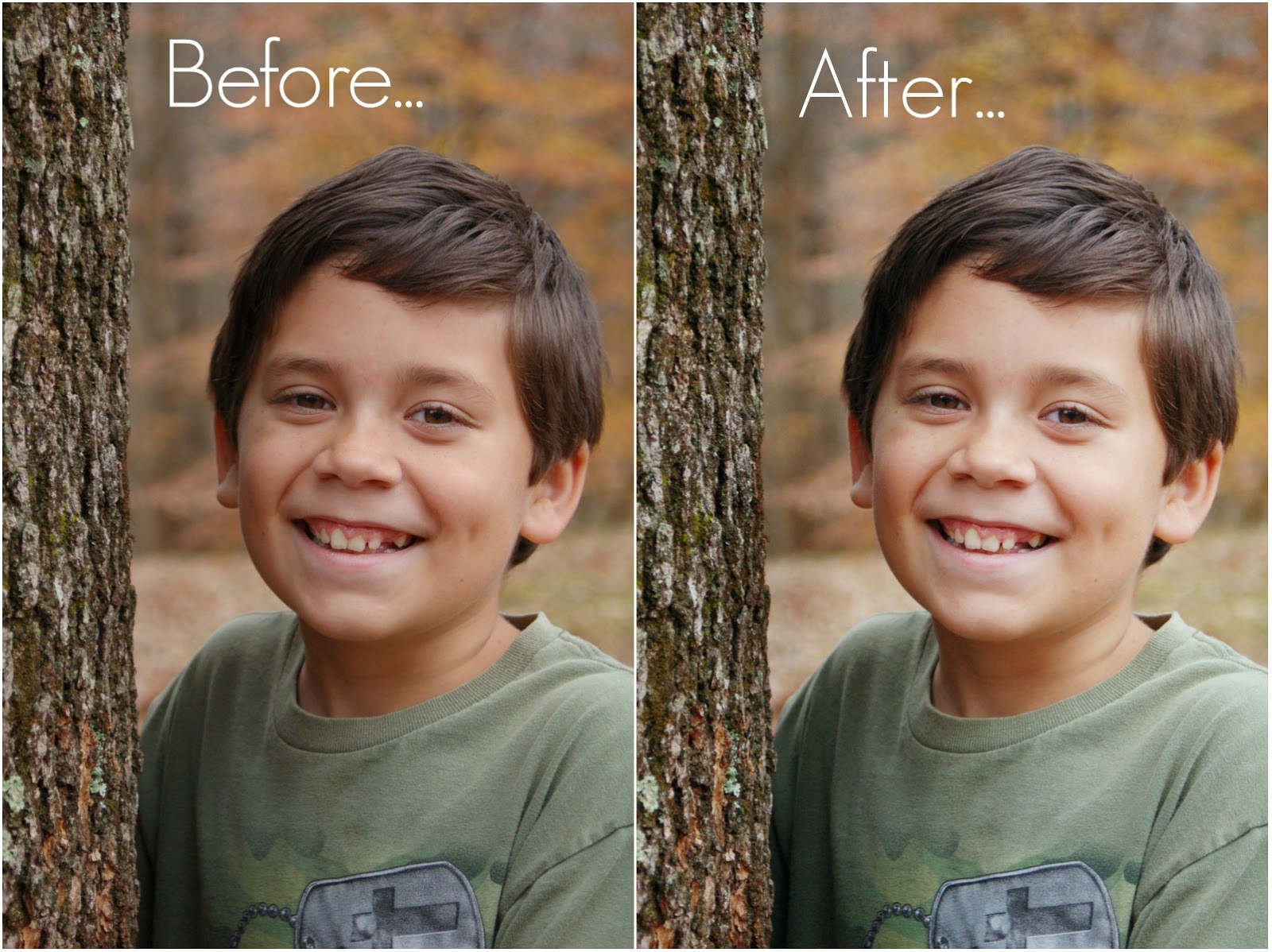 Here is a link to Pixlr. Again, it's completely free, and I don't remember ever seeing ads on there. (Take that back lol, mine has ads for modcloth on the opening screen. But after that there are no ads) And this is a tutorial of how I typically edit my portrait photos. Each image is different, and obviously each person editing will do it different. I'm not saying this is an exact science here, I'm saying this is what works for me. And I'm not always exact, I mean eyeball it, once you do it for a while you'll just know if a photo needs a 3 or a 4 of contrast, or a sliver or a half inch of curves, ya know?
So to begin. When you open up the site, it will look like this.
Scroll down a little bit, and you will want to "Launch Web App". I've never even clicked on the other ones....but now I think I might :P
Then you will select Open Image From Computer, and browse to select the photo you would like to edit. I'm going to edit a picture of my little brother Stephen, for demonstration purposes :).
Here is a link to Pixlr. Again, it's completely free, and I don't remember ever seeing ads on there. (Take that back lol, mine has ads for modcloth on the opening screen. But after that there are no ads) And this is a tutorial of how I typically edit my portrait photos. Each image is different, and obviously each person editing will do it different. I'm not saying this is an exact science here, I'm saying this is what works for me. And I'm not always exact, I mean eyeball it, once you do it for a while you'll just know if a photo needs a 3 or a 4 of contrast, or a sliver or a half inch of curves, ya know?
So to begin. When you open up the site, it will look like this.
Scroll down a little bit, and you will want to "Launch Web App". I've never even clicked on the other ones....but now I think I might :P
Then you will select Open Image From Computer, and browse to select the photo you would like to edit. I'm going to edit a picture of my little brother Stephen, for demonstration purposes :).
Select the photo, click open. Or just double click on the photo you want to open.
Tada! You will notice the photo is sideways though, so go to the tool bar at the top, and click the tab that says "Image". Then select rotate. If the one rotate doesn't work (meaning your photo is now upside down), rotate it the other way :)
To see you whole photo in your working screen, go to where the pink arrow is pointing, which is the zoom out button/slider. adjust to where you can see your entire picture.
To make a copy of your layer, take your mouse and click on the layer that says "Background". Still holding down that click, drag the background down to a little "new layer" button next to the trash can.
Showing the layer getting moved.
Now you have two layers. "Background" and "Background Copy."
Then there is this little button that I'm not sure what it's called, but it shows like how that copy layer will show over your background image. Play around with the different settings, there are quite a few. I typically use the setting called "Screen."
Scroll down in the little drop down box that appears when you click on that layer settings button.
Select the setting called "Screen".
It brightens it up quite a bit! Now I think this lighting is just a little bit harsh.
So what we'll do is take the Opacity slider and make the Opacity less. I kind of eyeball it. Probably decrease it to about 50-60 percent.
Then to seal what we've done so far back into one image, go to the tool bar again and click the tab that says "Layer", then "Flatten Image".
Now you just have one layer, called "Background" again. :)
Up at the toolbar again, click on the "Adjustments" tab. Select Brightness and Contrast.
I like to have my contrast set at 3 or 4 typically...and rarely do I mess with the brightness level. If the photo is really bland, contrast won't work as well as if there is a lot of different colors. If there are a lot of different colors contrast can really make it pop! Once you've selected the amount of contrast and or brightness that you want click OK.
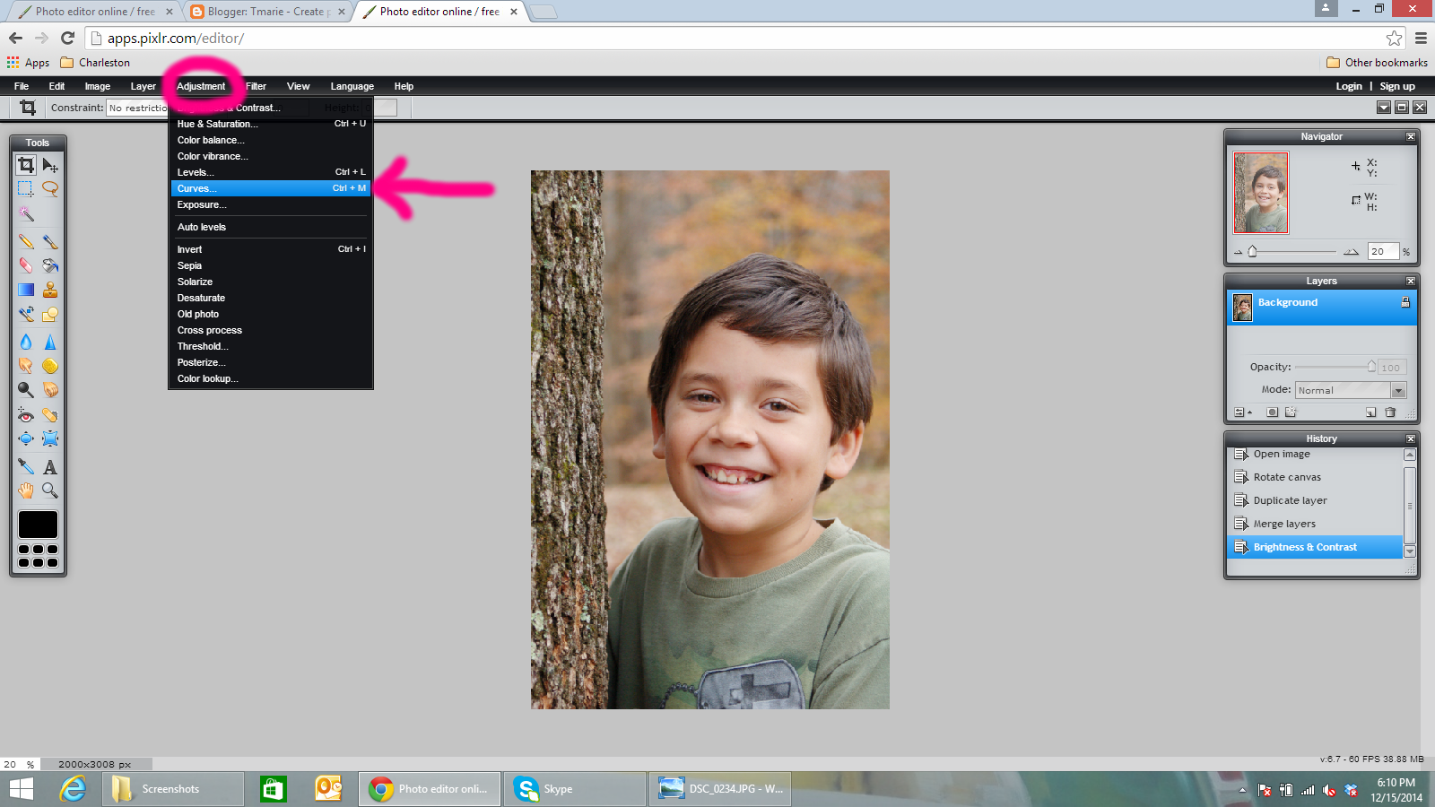
Go back to the toolbar and click the tab called "Adjustments" and select "Curves".
.png)
Curves just adjust the light in a way that really defines the image and makes it more vibrant I think.
On that line that you see in the pop up box, click to make a dot in the bottom left corner of the top right square.
Drag up just a little bit to lighten/brighten the image. The more you drag, the lighter/brighter your picture will become.
Click to make a dot of the upper right corner of the bottom left square, and then drag down a little bit. This makes the darker tones in your picture become more pronounced. I typically barely move that end of the slider.
Then we go back to the toolbar and select "Adjustments" again. Click "Color Balance".
I think the photo looks a little too red over toned. So I'm going to take the Red slider and slide it down so it's at about -5. Then I take the Blue slider and increase it to about 3. Then I clicked OK. And your photo may need less red and more blue. I've never seen a photo that needed extra red, but almost every photo I take needs a little bit of blue.
As a finishing touch on my pictures I like to use the "Burn Tool". I don't know what that little tool gadget thing on the left side is called, but its on there. Tool map maybe?
It's default brush size is TINY, so go to Brush at the top, just under your toolbar.
Select the largest size of the feathered brush.
And slide your size up to as big as it will go. 999 I think it is.
Then I lightly burn the areas that I want darker than the rest. This works kinda like a Vignette, but less obvious and it really makes your person/item stand out. Don't over do it then!
I painted it with pink you could see what burned.
Now that you are done editing your image, and you are happy with it, you have to save it! Go to the toolbar, click the tab "File" then "Save".
Rename your photo here, either with an actual name such as "Stephen Portrait 2014" or just add something to the end of the original name such as "edit". This way it saves it as a different photo, and you still have the original to go back too. After you've named it click ok, then you're done!
I hope this was helpful to ya'll, and I'll do some more tutorials soon, like how to adjust color balances for really bad lighting in photos, straighten images, crop images, and anything else I can think of. :)
p.s. My spellcheck wasn't working today, so if there are some pretty screwed up words I'm sorry!


.jpg)
.jpg)
.jpg)
.jpg)
.jpg)
.jpg)
.jpg)
.jpg)
.jpg)
.jpg)
.jpg)
.jpg)


.png)
.png)
.png)
.png)
.png)
.png)
.png)
.png)
.png)
.png)
.png)
.png)
.png)
.png)
.png)
.png)
.png)
.png)
.png)
.png)
.png)
.png)
.png)
.png)
.png)
.png)
.png)
.png)
.png)
.png)
.png)
.png)


